Reporting In Dynamics CRM

My most popular posts seem to be around dashboards and charts so I thought I would write another post explaining the reporting options within Dynamics CRM.

In many of my initial conversations with clients they always ask about reports.  A common complaint about other solutions and systems are that they can get data into it ok…but getting it out and using the data to make business decisions is either very difficult or near impossible.

Below are a list of options that are available to Microsoft Dynamics CRM users:

  • Advanced Find.  This is the one I use most on a day to day basis.  This is basically a query on the system  i.e. show me all Accounts where the “Owner” = Richard Dunlop and the “City” = Belfast.  It is very simple to use and all your CRM users should know how to do this.
  • Views.  For queries that are run on a regular basis, the user can save an Advanced Find as a “View”.  This allows you to save queries and view them quickly without having to retype the information.  More details about Views can be found in my last blog post here – http://bit.ly/sKIrhK
  • Charts.  These can either appear in a dashboard (which I will come to next) or in-line with the data.  Within a screen (e.g. Accounts) there is an option at the far right to show a chart that links to the records on the screen.  Additional charts can be set up.  Below is an example showing a list of Accounts and a chart showing the split by Industry:

  • Dashboards.  Users can be greeted by a dashboard that can contain charts, grids (e.g. list of all “My Accounts” or “My Opportunities”) and web resources (virtual files that are stored within the CRM database that can be retrieved via URL).  Custom dashboards can be created and aimed at certain business roles; a number of standard dashboards come pre-designed.
  • Export to Excel.  Data can be quickly dropped into Excel.  This can be dynamic or static; static takes whatever is on the screen when you click “Export to Excel”, dynamic can be a query e.g. “All Accounts where City equals Belfast” this means if new accounts are added with City equals Belfast, the data will be updated in Excel next time it is opened.  More details about Export to Excel can be found in my previous post here http://bit.ly/lNIjzK.
  • Report Wizard.  Microsoft have provided a number of standard reports that use SQL reporting services.  These are for reports that are a bit more complicated than a simple query.  More details on the report writer can be found in Microsoft’s Resource center http://rc.crm.dynamics.com/rc/regcont/en_us/op/help/source_rpt_wizard.htm
  • Custom Reports.  If you are looking to get data from a number of different tables and in a particular format, you may need to look at custom reports.  This will be using the SQL back-end data and using software like Visual Studio to write bespoke reports.  This may be beyond the capability of some IT departments but all good Microsoft Dynamics CRM partners will be able to write these reports for you.
  • SharePoint.  There are a number of tools (including Performance Point Services) that allow for great interrogation of data.  The main advantage of using SharePoint for reporting is that it is a great way to share the information across the organisation.

As you can see there are a number of ways, depending on your requirement, that you can get all that data from your CRM system into a format that is useful and that allows the organisation to make key business decisions using key business data.

I hope you found this useful and let me know if you have any questions.


Twitter Analytics Dashboard

Another dashboard post but this time looking at social media and not CRM directly.

This tool is great if there are trends/topics on Twitter that you want to keep an eye on.  This is a great way to set up a standard dashboard that lets you see what people are saying about topics that are related to your business; and also lets you learn when is best to tweet and who is influential online.

This excel add on allows the user to set a number of topics (max 5) that they want to monitor (this may be their brand name, their competitors, or areas that are important to their business i.e. CRM for me).

Once set up Excel (and more importantly PowerPivot) connect to Twitter and builds a database with all the information from Twitter and presents it in an Excel dashboard.

This allows the user to analyse tweets between a certain timeframe.  Areas that can be analysed are:

  • Number of tweets
  • Retweets
  • Mentions
  • Hashtags
  • Dates
  • Trends
  • Time of day
  • Positive/Negative tone

It uses the “Slicers” in Excel 2010 to drill down into the data and allows the user to compare/interrogate  the data.  The user can even look at the actual tweets in another Excel tab.

Below is a quick screenshot of the dashboard in Excel 2010:

You can download this add on for Microsoft Excel 2010 from http://bit.ly/twitterBI

Another tool for learning what people are saying about your business online.

Dashboards: Part 2

One of my most popular blog post has been about dashboards.  I thought I would look into this in more detail and look at different ways you can use the data held within CRM.

This time however, instead of using the dashboards in CRM (which I do love), I am going to do the reporting in Excel.

First of all I am going to show you how to get the data out of CRM (whether this is online or on-premise).  Within every screen there is an “Export to Excel” option which is highlighted below in the Opportunities screen.  Selecting this gives you 3 options.

You can either take a snapshot of the data right now or get dynamic data (i.e. a live connection from Excel to the CRM database).  For reports that are repeated monthly, dynamic is your best bet as you when the Excel report is opened the data is live data from the CRM database; this saves you having to build the same report each time you need it.

You can choose the columns you want to bring to Excel.  Choose as many as you need depending on the reports you want to drill in to.  This is a standard CRM site so the fields are Out of the box.  I have chosen to bring the following fields:

    • Owner (i.e. Sales Person)
    • Est. revenue
    • Est. close date
    • Topic of Opportunity
    • Potential Customer
    • Probability


This now saves an XML on your local computer.  Open this file and you will be told that you have to enable the content.

Click Enable and go to the Data tab and either Refresh from CRM or Refresh All.  CRM Client for Outlook has to be installed for this to work.

You now have your CRM opportunities in Excel for analysis.  This is where real Excel pros can have some fun.  I am going to leave this data where it is as it is connected to the CRM database.  I am going to create a new sheet in this workbook and call it Dashboard.  Here I am going to build a pivot table and use charts and “slicers”.

I am not going to go through how to build a pivot table as many of you will have done this multiple times.  However to explain my dashboard, I have made the row hierarchy Owner > Potential Customer > Topic and values the Estimated Revenue.

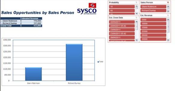
I now have a pivot table to work from.  Using Excel 2010 features I can now create “slicers” to drill down and view the data I want.  I created 4 slicers, Probability, Est Close Date, Sales Person and Est Revenue.

I have also created a simple chart to visually show the data in the pivot table.

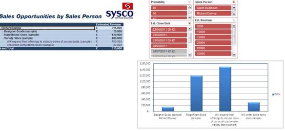
I can drill down on the data and use the slicers to filter.  Below I have just picked Richard Dunlop as the Sales person and drilled down to view all the Potential customers and the Topics of the opportunities.  As you can see the chart changes to represent the data in the pivot table.

Below I have shown all opportunities that are 80%-95% likely to close.  As you can see Glenn’s 3 opportunities are a lot better than the small opportunity Richard has.

If I use the slicers to show the opportunities that are estimated to close this month (June) I can see that only Richard has opportunities and 2 of which are high value opportunities; I now know to focus on these to hit my targets.

This is another simple way to run reports and analyse the data from your CRM.  This data can be shared within the organisation as well as on SharePoint.  More sophisticated dashboards can be built with multiple data sources to provide key information for business decisions.

I hope this shows you just how simple it is to build reports using Microsoft Dynamics CRM 2011 and Excel 2010.  If you have any questions just leave a comment below.

Managing goals and your sales pipeline

Recording your actions in CRM is great – but at the end of the day a sales person (or any end user) wants to make sure they are meeting all their targets or KPIs that their organisation has set.  You want to make sure you are on top of things…and you want to know how quickly and easily you can hit (or ideally smash) your target.

Microsoft Dynamics CRM allows users to see quickly how they are doing each time they open Outlook/CRM.  Goals can be created over a certain period or one of the set fiscal periods within CRM.  They can also be used to track number of calls made, appointments completed, opportunities created as well as revenue brought in to the organisation.  Multiple goals can be created and a dashboard can display a snapshot of the goals for each user.  Below is a screenshot from a dashboard; the middle chart shows the 4 goals that the current user has as well as a sales pipeline funnel.

The areas to notice in the chart are the grey areas, the green areas and the blue circles.

The blue circles are the target that the user must achieve in this period (this has been set to quarterly).

The green areas are opportunities that have closed and the actual revenue that was won with the deal.

The grey areas are the potential revenue if the opportunities in the pipeline are closed.  This lets the user see that if they work on their current pipeline whether they will meet (or not meet) their target.

Using the example of the “Products” goal; the green area is almost at the blue circle but if the user closes all the potential opportunities the will be well clear of their target.  This is where the left hand chart comes into play (Pipeline).  The pipeline chart shows the potential revenue at each stage of the sales cycle (top = initial contact, middle = develop, bottom = close).

If the salesperson clicks on the bottom section of the sales pipeline (this is the area that is classed as in the “Close” sales pipeline phase) a number of options are available to drill down.  If the salesperson selects campaigns (which is used for the goals; Advertising, Products, Services and Support) they will see all the opportunities in the close phase by campaign.  Below is an image showing the salesperson selecting the close phase/campaign and the resulting graph.


This graph now shows that there are three campaign opportunities that are in the close phase of the sales pipeline.  The salesperson can see that of these opportunities there is £6,000 potential revenue for products.  Closing this sale will allow the sales person to meet their “Products” goal as shown in the top image.  The salesperson can select the bar in this chart and go directly to the opportunity.

This allows sales people to manage their opportunities and their goals more effectively.  From their main dashboard (which welcomes them in Outlook), the user can quickly identify their target goals, identify what opportunities are about to close that meet that goal; and go directly to that opportunity to work on it and hopefully close.

Conclusion

At the end of each month, sales people will want to see what is the easiest and quickest way to meet their targets.  Having a dashboard which clearly states where they are in relation to their goal, and what opportunities they have that will help them meet their goal; users can quickly drill down and get to work on the right opportunities.  This prevents wasted time trying to find opportunities to close as well as ensuring those at the end of the sales pipeline (i.e. those with the greatest importance) are dealt with quickly and effectively.

Dashboards and charts in Dynamics CRM 2011

My role has been to look at both Dynamics CRM and Business Intelligence and I must admit I got excited when the latest release of Dynamics CRM came with out of the box dashboards (CRM and BI geek).

I am going to walk through these dashboards and the features I like most.  As anyone who has trialled Dynamics CRM online will know, the first thing the user sees is a dashboard – showing a number of charts and tasks.


This dashboard shows the CRM overview but users can select a number of predefined dashboards using the dropdown menu about the “Sales Pipeline” chart.  Users can choose the following dashboards out of the box:

  • Customer Service Operations
  • Customer Service Performance
  • Customer Service Representative
  • Marketing
  • Sales Activity
  • Sales Performance

Custom dashboards can also be created by the user so they can see data that is relevant to their day to day needs.

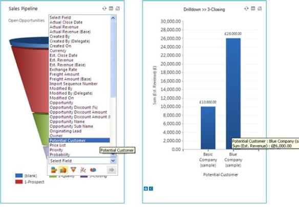
One of the fantastic features of these dash boards is the ability to drill down into the information to look at the data in more detail.  The idea between dashboards are to give a snapshot of what is happening, if there is something that needs attention, users should be able to get directly to that information and start making business decisions.  Dynamics CRM allows the user to click and drill down on any field within the record and display this data in a different format.  The picture below will explain better:


The first image shows the sales pipeline funnel found on the main dashboard.  By selecting the pipeline phase Closing the user can drill down and look at all the “Potential Customers” that are in it.  I have decided to represent this data in a column chart and the results can be seen on the right.  This shows the user that within the Closing phase in the sales pipeline there are two opportunities, one valued at £10,000 and a second at £26,000.  This allows the user to see that they should be focusing on the Blue Company’s opportunity as it will bring in a larger revenue.  There is quick access to the sales opportunity records that are behind this chart and allows quick access to the underlying data.

New dashboards can be created using the Dashboard Ribbon and give the user the ability add charts (eg funnels, bar charts, columns, line or pie) lists from CRM (e.g. opportunities, accounts, to do tasks etc), Iframes (this shows a web page and could point towards a search engine or a company website/intranet) or a web resource (this could be an application built using Microsoft Silverlight).

Each item can be placed wherever the user wants and expanded to fit the whole area – the dashboards are very flexible and I would recommend users create one and use the Dashboard Ribbon to see how easy it is to get the information they want in an easy to view layout.

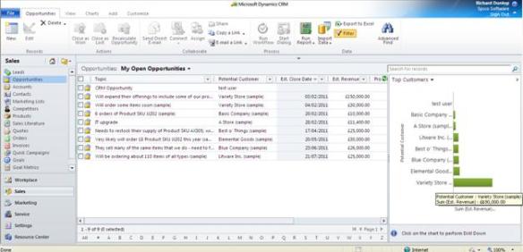
Charts can also be used throughout the Dynamics CRM; an example of this is viewing the opportunities as shown below:


The user can view all their opportunities; on the right they can select a number of available charts.  The default shows the top customers and the estimated revenue from these customers.  The charts available are:

  • Actual Revenue by fiscal period
  • Actual Revenue by month
  • Deals won vs Deals lost
  • Deals won vs Deals lost by fiscal period
  • Deals won vs Deals lost by owner
  • Estimated vs Actual Revenue (by fiscal)
  • Estimated vs Actual Revenue (by month)
  • Opportunity by campaigns
  • Revenue generated by campaign
  • Sales leaderboard
  • Sales pipeline
  • Sales progress by territory
  • Top Opportunities

As you can see there are a large number of charts out of the box with Dynamics CRM and new ones can be created.

A possible scenario:

A salesperson is coming up to the end of a month; they are behind on their revenue target and want to close the opportunities with the highest value to make the target.  They open all their opportunities like shown in the image above.  They can see they have 9 opportunities but want to target one with high revenue potential.  They can see by the chart that the Variety Store (bottom bar in bar chart) has an estimated revenue of £180,000 compared with the other customers who have considerably smaller estimated revenues

The user selects this customer on the chart and filters the £180,000 by Probability.  Dynamics CRM then changes the view to represent the new data as shown below:


The user can easily see that there are two opportunities, one at £150,000 and one at £10,000.  They can also see that the probability of closing the larger opportunity is much greater (75% rather than 10%).  The user can now go directly into the sales opportunity and close the business; hopefully bringing in £150,000 revenue and meeting his target.

Conclusion

I just wanted to highlight a few areas around dashboards and charts and this will hopefully give you some ideas to look at when working with the Dynamics CRM 2011 trial.  I think this is one of the greatest advancements in this latest release and it lets the user get a quick snapshot of the data stored BUT allows them to get to the information behind the charts quickly…meaning more productivity and working more effectively.

If you have any questions around the dashboards or want a demo set up/talked through just send me an email rdunlop@sysco-software.com